Curriculum Mapping, Your Biggest Mistake
 By: Tony DePrato | Follow me on Twitter @tdeprato
Curriculum mapping is not a mistake. However, schools seem to make the same mistake over and over when implementing and using curriculum mapping tools. How do I know? Because I always hear different people, from different schools, make the same statements. These statements are not accurate, and I know they are not accurate because everything that is apparently impossible to do, I can do. The reason I can do the impossible is because when I was a baby, my mother held me by my ankles and submerged me into a flowing river, and then Zeus…
No, actually, the reason I can do the impossible is because I put reporting and reporting goals first, and data entry and interface navigation last.
When schools focus on how to click through menus, instead of empowering a small team of people to view thousands of data points, they have essential made data entry more important than data usage. Data driven, does not mean people should be focused on typing as much as possible. Data driven means using data to make decisions. These decisions should be stronger than those originating from rumours, speculation, or anecdotes.
Entering data is like chopping wood. It provides instant gratification, like when people give a thumbs-up to a picture of your cat on social media. Unfortunately, simply entering data is about as useful as that picture of your cat.
Using data can be complicated, and it requires that the end-users follow a set of criteria. The goal needs to be something known as Data Normalization. Despite the name, it does not mean data all needs to be the same. Data normalization is a process that attempts to reduce redundant data, or data points that are going to waste time. Data normalization makes it possible and efficient to search the type of data classrooms create.
Unfortunately, the majority of people reading this post probably have been doing some sort of curriculum mapping, and are not starting from scratch. I feel your pain, and I know how it feels to look at a huge set of data and wonder, “How can I fix this?”.
I have good news, and I have one tip. Follow this advice and your data analysis can find new life. Enter the concept of the hashtag (#).
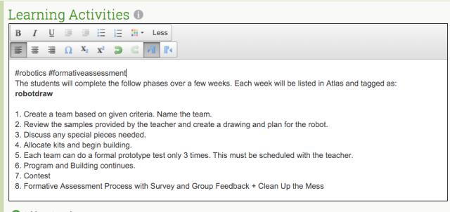
Twitter commonly is associated with hashtag based content tracking. For example #curriculum, #edtech, and #goodmemeofthedayphotos. Hashtags are just characters, and characters can be searched by any modern database. Therefore, it is fairly easy to hashtag your curriculum map. Here are the steps to follow:
- On the map template choose an existing box or section that allows you to type plain text, or going forward, have everyone include the hashtags in the unit/project/assignment names. It is so much work to rename units. This is best to do at the beginning of the year as policy.
- Create a set of hashtags for the people entering data, and post these publically so people can copy and paste them. Do not use email for this. Post them online so they can be centrally managed and updated. A small sample might look like this:
#literature (Always use Lowercase and No Formatting)
#formativeassessment
#16thcentury (Always All One Tag No Spaces)
#robotics
#crosscurricular
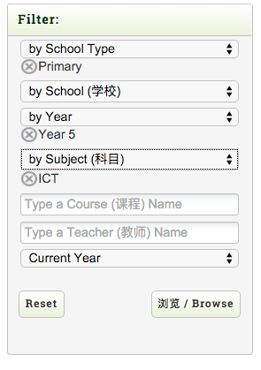
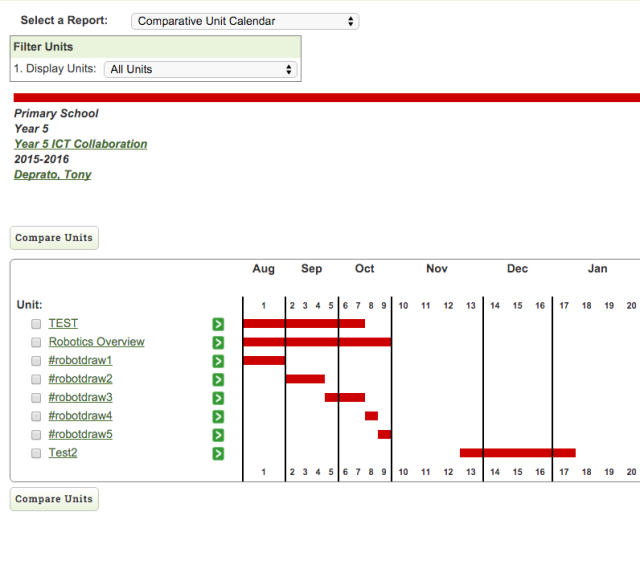
#khanacademyresource - When it is time to run reports use normal filters. School-Grade Level-Subject. Once the filters are applied, you can search for tags. Using hashtags in unit names is the most effective way to do this, but searching in the template boxes should not be ruled out. Once a set of horizontal curriculum data is on the screen, the hashtags in the content can help people visualize data.
Here is the process below, displayed graphically, from Atlas Rubicon.
For more ideas on using curriculum data, please comment on this post or email me directly. Workshops online or live person-to-person are also an option for those needing more support or starting out with curriculum mapping.
Tony DePrato
http://www.tonydeprato.com
tony.deprato@gmail.com


You must be logged in to post a comment.