Lucidspark – A review
There are a bunch of whiteboards out there you can use to collaborate with your colleagues or to use with your students. There is Padlet, Wakelet, Google Docs, OneNote and more. However, when I saw that Lucid had created their own whiteboard collaboration website I was excited.
For those of you who are not familiar with Lucid they make some great web based applications. Lucidchart (for flow charts and the like) Lucidpress (for dynamic web publications that look exceptional).
I really like what they make and I find their products to be simple yet powerful and most of all effective. This is why I was so excited and let me tell you, Lucid did not disappoint.
Signing up
You can sign up with Google, Microsoft or Yahoo. You can also sign in with your email address. Accounts are completely free though there are paid accounts which remove limitations and unlock features. For this review I will be talking about the free version. So signing up is a breeze.
Dashboard
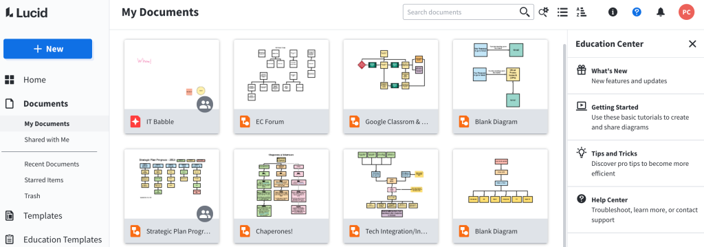
This is again very straight forward. You can create a new Lucidchart document or Lucidspark Board, you can open boards that you have created before and you can organize your documents or boards into specific folders. Pretty nice, pretty simple, pretty effective.
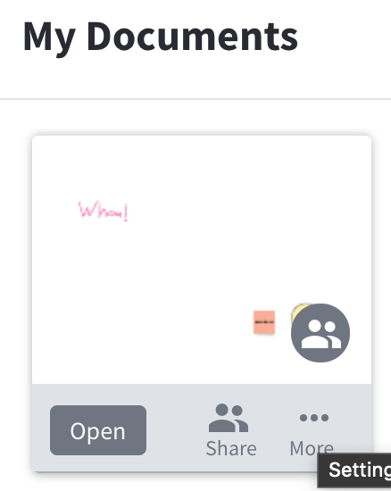
Not only can you create and organize from the dashboard, you can also share out documents in a variety of ways. Here is a current Lucidspark Board called IT Babble I am messing around with. If I move my mouse over I can share it with another person (I just need their email address.
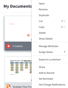
If I click the more area, I have a ton of options. I can copy, rename, delete and much more. Just check out those options.
Creating a Lucidspark Board
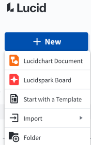
This is super easy as you would guess. Just click the New button from your dashboard and select Lucidspark Board.
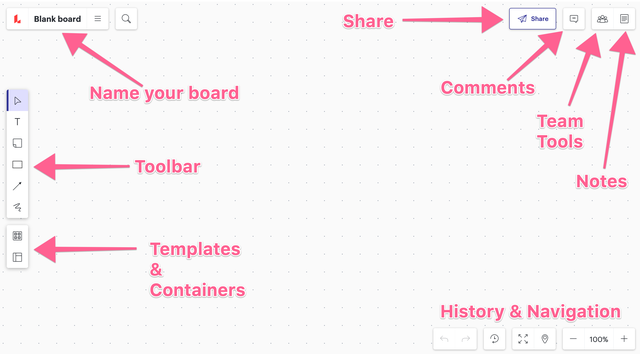
A new board will be created and I’ll be honest. At first it is a little intimidating. It looks like a limitless plane with very few options. Let’s go through those options.
- Name your board – Here you can name/rename your board, you can also get back to the dashboard by clicking the Lucid logo. Clicking the three lines gives you more options
- Toolbar – Here you can add sticky notes, arrows, sketches, text and the selection tool
- Templates and Containers – Here you can add templates and containers to help use pre-made documents. More on this later on.
- Share – Here you can share your board to others.
- Comments – This is a premium feature. You can also see what people are currently working/viewing the board.
- Team Tools – All premium features here but they’re pretty cool none the less
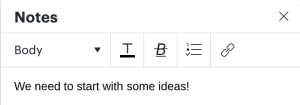
- Notes – Here you can write collaborative notes. Great for guidelines and assigning topics to people.
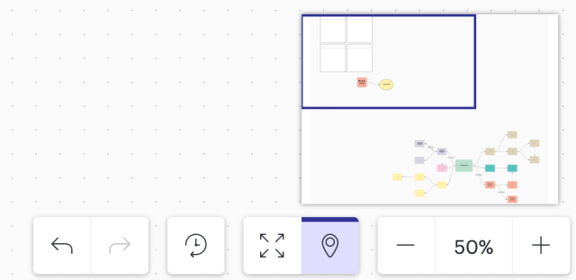
- History and Navigation – Since the space can get very large, this can let you zoom out, in, see a mini map of the board, undo, redo and see a revision history of the board.
Many of the features seem pretty straightforward and many are, but there are some great little tricks.
Sticky Notes
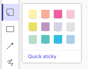
They seem pretty easy to use and you would be correct. Adding them to your board is easy, but you can also create a Quicky sticky (that is an unfortunate name) which makes it even easier.
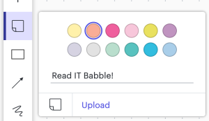
When you click Quicky sticky, you still see all the colors the sticky note can be but you also see a line to type. Type what the note should say and hit Enter.
Your sticky note will just appear on the board!
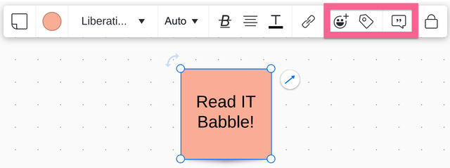
The goodness doesn’t stop there though. If you click on the sticky note you will notice a few other features.
The happy face will allow users to respond to certain sticky notes (or any note). There is also a tag that can be used to quickly organize (especially if you have the paid version).
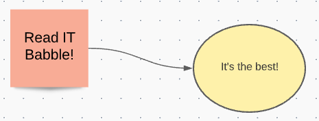
Did you notice that arrow coming from the sticky note? That arrow will allow you to create a line to another sticky note or object. Great for flow charts. Also, when you move one element that is connected to another element, the arrow will move and adapt with that movement.
Containers & Templates
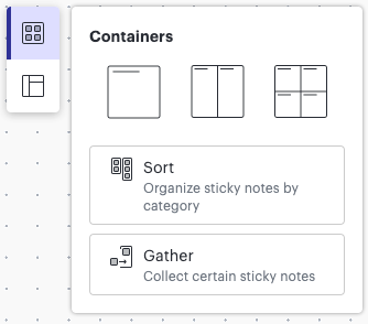
These are useful if you have the paid version and if you tag your items. You can quickly organize those items together in a single space or . . . container.
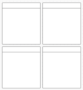
You can create those organization spaces though with the free account and then you can manually move organize those objects.
Templates on the other hand are way more varied and way more useful (if you are rocking the free account).
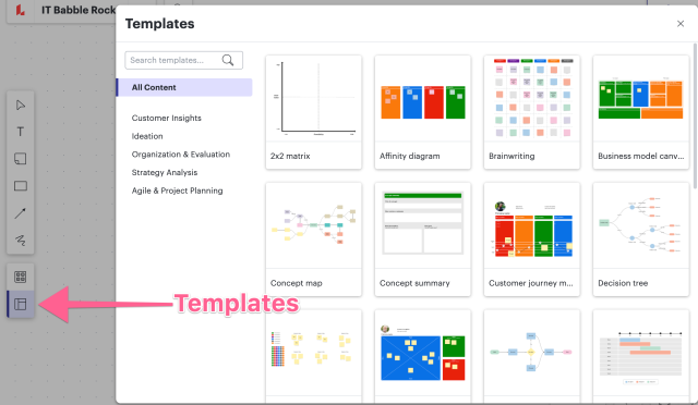
When you click the Template icon it immediately launches the Template picker and there are PLENTY to chose from!
When you click a template it gives you a description of what you can do with it and then there is a button to insert the template in your board. Once you click that it still does not place it, but lets you decide where you want to actually place it.
One nice thing about the templates is that they are completely editable. You want to remove, add, change an element – go for it! You want to redesign what they Lucid has made, knock yourself out!
Navigation
Since the board is pretty much infinite it could be easy to lose materials or notes. Worry not, Lucid took a page out of Photoshop’s playbook. In the bottom right hand corner you can turn on/off the mini map. Which is exactly what it sounds like.
 When it is on, you can zoom across your board and find all that important info.
Also down in the bottom right hand corner is revision history. That will show you all the changes made to the document and you will have the ability to roll back or restore to a previous state. This is a paid feature.
Then there is the undo/redo buttons which are included in the free version.
Share area
In the top right hand corner is a big Share button.
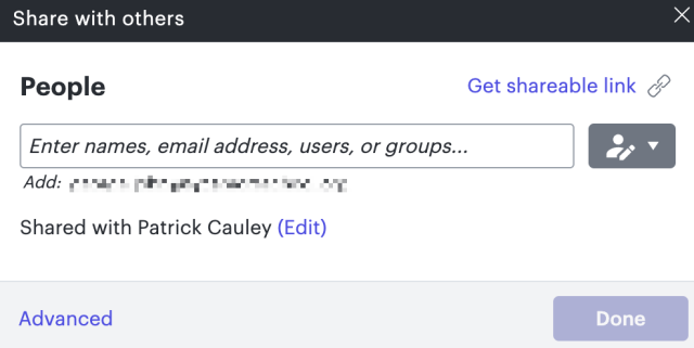
To share the document, all you have to do is click that button and type in their email address.
Like standard sharing, you can give specific restrictions with the people you can allow people to edit, comment, view on only or edit and share to others.
If you click the Advanced link at the bottom of that share window. This gives some really good options. You get a great overview of who you have shared the board with and what level of access they have. Also, you can Publish the board so it will be live on the Internet. This is great for presenting a static version of the document to a group of people. You can do it as a PDF, an image or a website.
Also in this section is the Comments and the Team Tools. Both of these are not included in the free version, though I wish the Comments were. Comments are pretty straight forward. A person who has access to the board can leave comments on specific elements on the board and others can see and respond to them.
The Team Tools are cool and definitely worth a price. They include voting, adding a timer to keep people focused and the ability to color code users. Also, they have a great follow me feature where a user can gather other users when they want to show them something.
Then there are Notes. Here the team can keep notes on what is happening. This is a great tool for keeping people organized and on task. Anyone can add to it and if you are doing a brainstorming session putting the goals you hope to achieve would give people direction towards what needs to be accomplished.
The notes is pretty basic but it you can add checkboxes which is nice. I prefer the simplicity. These are just notes after all and not someone’s thesis paper.
Conclusion
This is a great collaboration tool. I do wish Comments were included in the free version but hey – you can’t always have it your way.
If teachers are using Padlet or Wakelet, should they consider switching? I don’t know. If you are a teacher using those tools probably stick with them, but if you are looking for something new Lucid Spark is definitely worth a look.
It feels more professional and clean than others. While it may not possess all the bells and whistles that others have, I feel that works in its favor. It keeps distractions down to a minimum and keeps the focus on the work at hand.
Source: IT Babble Blog and Podcast



You must be logged in to post a comment.