Forky – A review
Yes it is 
I like mind mapping tools. I use it every now and again to brainstorm solutions to complex issues. It helps get a good view of everything I need to consider and to prioritize which areas to focus on and how.
Forky.io is another in a long line of online options out there for mind mapping. The idea behind this is that it is a simple and collaborative tool that keeps the mind map front and center. No clunky windows, not a lot of unnecessary menus – just your mind map.
Here is the example mind map when you start.
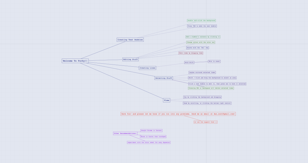
As you can see it is as I described it. So let’s take a deeper look into this tool and see if it is worthy of your classroom.
Signing up & the dashboard
Pretty straight forward. You can sign up with your Google account, your GitHub account or sign up by typing in your email address.
The dashboard has your Diagrams (or mind maps) that you’ve created or one’s that have been shared with you.

Also, you can create a new mind map here and you have an ability to organize it with folders. I do like that. Too many services just list these (chronologically or alphabetically) in your dashboard and leaves it up to you to sort through them all. Nice work people!
There is also an option to change different themes. Rather than just a light or dark theme you have some other colors you can use if you like. It’s a nice little touch but nothing that makes a huge difference for me.
Making a Diagram (mind map)
When you create a new one it immediately makes you name it. THANK YOU! I don’t how many Untitled documents I have floating around out there.
Once you get into the diagram it is all pretty straight forward. There is a very helpful Getting Started menu that you can bring up at anytime and it goes over the basics for you.
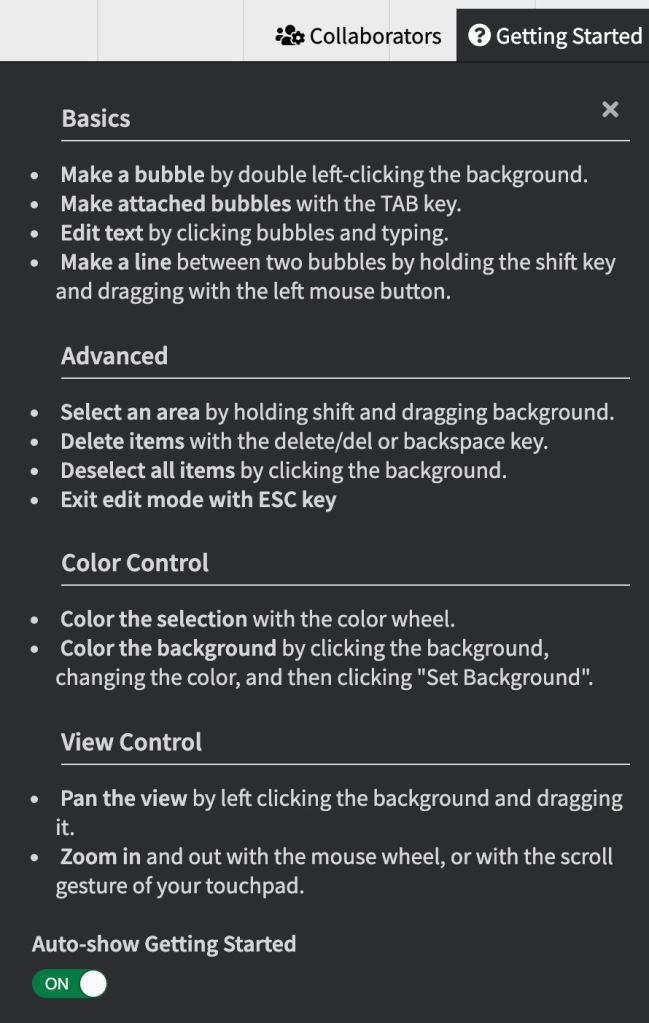
The title of the Diagram is center node. To zoom in and you use your scroll wheel on your mouse or use two fingers on the trackpad. Click anywhere on the background to move around the document.
At the bottom in the center is the color wheel.
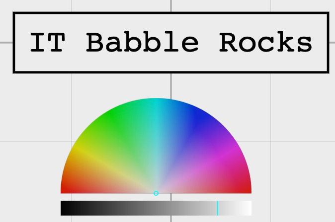
To use, select a node and then make the adjustment on the color sun and it will reflect that change. It’s as simple as that.
The canvas appears to be nearly limitless, but don’t worry. If you ever get “lost” in the document, there is a zoom control in the bottom right hand corner. There is a little cross-hair icon. Just click that and it will center and zoom you in.

To make a new node just select a node you want it to branch from and hit the Tab key on your keyboard. Once it has been made you can drag it anywhere you want, change the color, etc. When you have a node selected it will have a dotted line around it. The color of the line will be that of the parent node and unless you change the parent node color you cannot change the color of any of the lines.
One thing I cannot figure out how to do is to make a dotted line between nodes. In the example that is presented, it can be done, I just couldn’t figure out how to do it. This is most likely coming soon.
If you want to make a stand alone node just double click on the background and you’ve got your node! Again, this sounds simple, but other websites in the past try to keep you locked into one central node that everything branches off of.
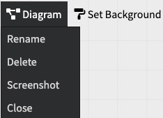
Something that I find is really neat is the ability to take a screenshot. If you click on Diagram in the top left hand corner, you get some basic options as you can see below.
Collaboration
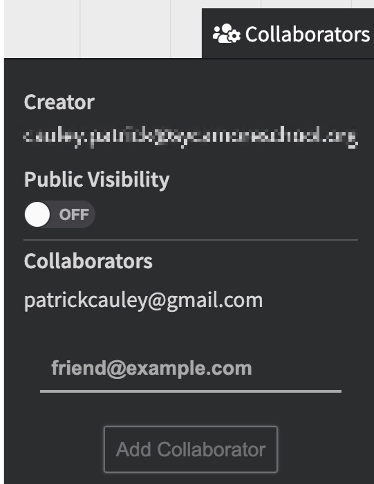
You can add collaborators. What is weird though is that you cannot see who you have invited to the Diagram. You hit the Collaborators button at the top of the Diagram, type in their email address and they get an email adding them to the Diagram. Once they accept the invitation, their email address will show up under this tab.
Issues/Wants
Forky works very smoothly and getting the hang of what it can do is pretty easy. That being said, it’s pretty easy because Forky can’t do a ton at the moment. There is no way to add images, no active hyperlinks and limited line types (though more options are coming soon).
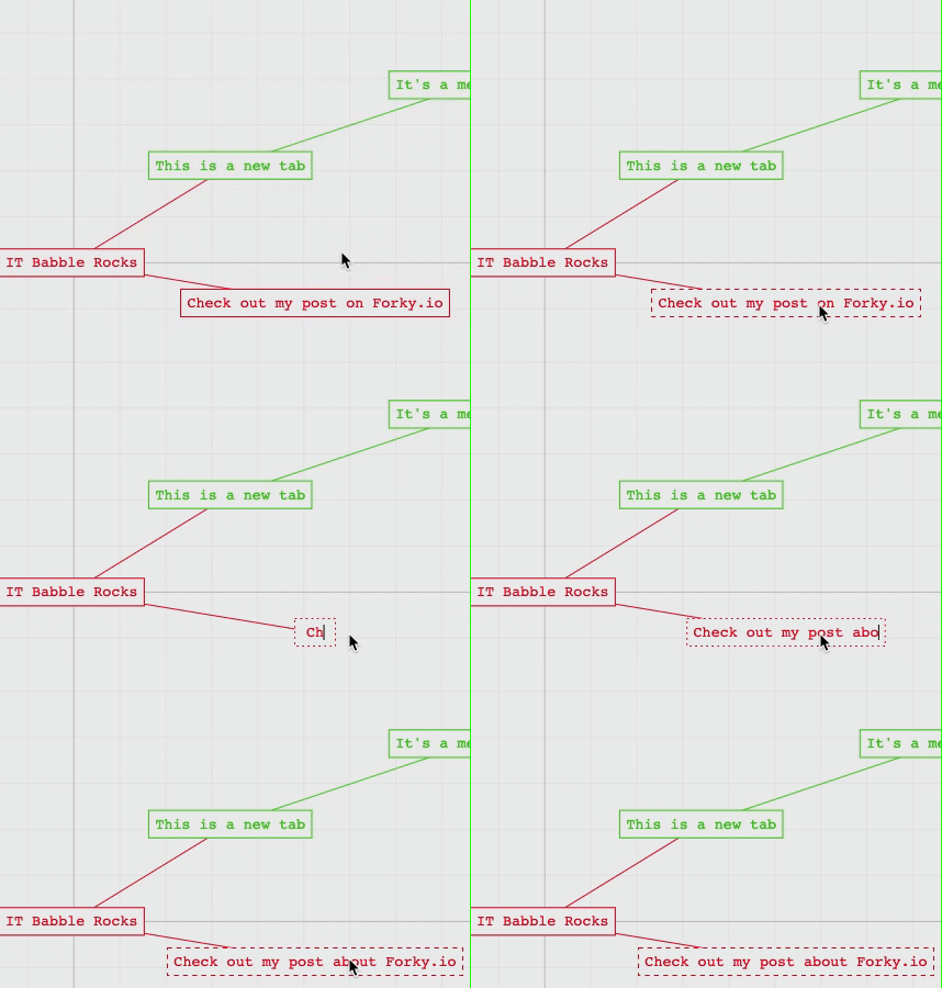
An issue I’ve seen in my short time is you can’t edit nodes. Well you can, but it is weird, let me explain. You cannot edit the text inside of a node. For example, I typed Check out my post on Fork.io. What I really wanted to type was Check out my post about Forky.io. There is no way for me to change out that one word. I had to delete all the text and retype it all.
Maybe this is a conscience design choice.
Conclusion
I like the minimalist feel of Forky and I like the ease of use. It is all about ideas and collaboration (if you want to collaborate). I like the customization of colors and even though it is limited, that is not always a bad thing. It gets out of your way and let’s you keep your ideas front and center. That being said there are some issues and real concerns.
Here is the big question: should you use it in your classroom? Maybe. If your students are older (high school or above) and you are using this as a place to brainstorm freely without having to deal with teaching them how to do everything. Then, this could work.
I still would recommend people using Coggle.it or LucidSpark instead of Forky.io, but if high school students want to use Forky.io I wouldn’t get in their way.
If middle or elementary school students wanted to use it, I would certainly not allow them due to its limitations at the time. I just know it would create more issues than ideas and that is not what a teacher wants of its digital tools. The lack of undoing is a serious concern and younger students like images and hyperlinks as do their teachers (in most cases.)
It is one to keep your eye on, but unless you are dead set on using it, I would find other options right now.
Source: IT Babble Blog and Podcast
You must be logged in to post a comment.