mult.dev – A review
It’s a weird name for a website. What this website does is to create a quick, animated map. I can see people making this to add to a presentation or website but I am not too sure about what else. I am going to dig into it a little bit and then report back. Let’s go
Signing up
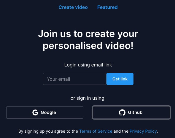
Super simple. You can sign up with your email or log into with your Google account or a Github account.
Creating a map
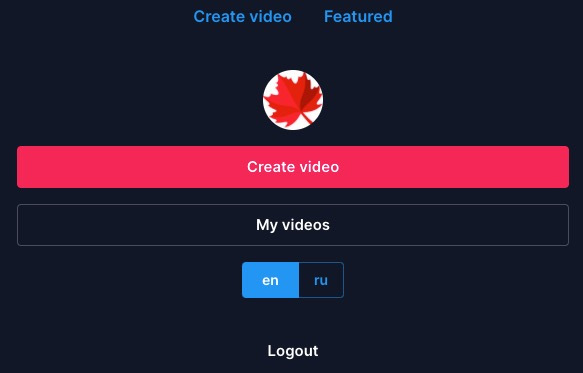
There is a dashboard when you log in, it takes you to a new trip.
To get to the dashboard click on the your profile icon (found at the top of the tools area). This will take you to a place where you can Create video or look at My videos.
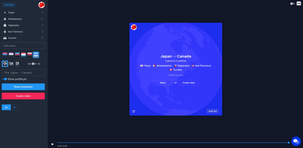
Once you are in, you will see a sample trip. The far left side are the tools. The middle is the preview and on the far right is an option to toggle high quality vs standard quality (at least that is what I think it does) and a chat option in case you want to share ideas or have questions.
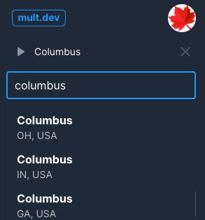
To add a place, just start typing and it will give recommendations. If you accidentally add the incorrect destination, you can hit the “X” by it and delete.
You can also reorder the destinations by clicking and dragging them up and down.
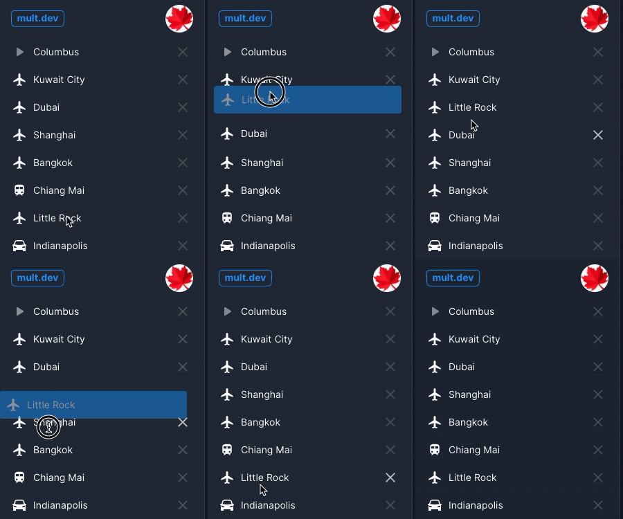
Your first location will have a play symbol next to it to signify this is the start.
When you add subsequent destinations you have an option to add an icon to denote how you would travel there. You can also change those, by just clicking on the icon.
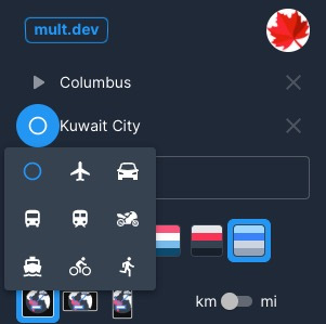
Once you’re done with that, you have some options. You can pick from six different color palettes, you can change the layout (square, widescreen, or smartphone). I think the square is the probably the best universally.
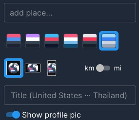
You can also pick between kilometers and miles (yeah – we’re stupid here in the US about refusing the metric system).
Then you can give it a name and chose to show your profile picture if you want to or not. Be default that last option is on.
Sharing
Now that it is made, you can share it. You have two options here.
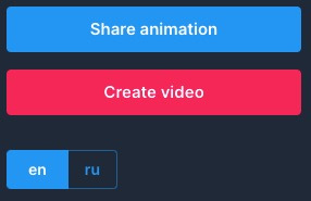
You can hit the Share animation button and it will give you a link that anyone can access to view with an Embed option.
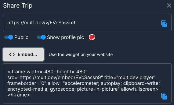
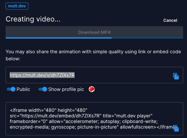
This is nice or you can go ahead and hit the Create video button which has all those sharing feature plus a way to download an mp4 version of the video. I really like that.
Conclusion
This is so simple to use I don’t see why a teacher wouldn’t consider it. The only “tricky” part is how to get the video into a presentation or website, but that is honestly not a big deal at all. Even younger students could manage this with some training and preparation.
I do wish we could slow down that animation or have different animations for different modes of travel (dotted lines for trains/automobiles, etc.).
One weird thing I noticed is that when I tried to download the video, it downloaded the sample trip instead of the trip I made. Also on this page you get a preview of the trip and I just assumed it would download my trip but it didn’t. If you’re a teacher be aware of this or it could blow up your class with a bunch of questions.
Another thing I saw was that if I canceled a video download it really cancels it! I couldn’t get it to download it again. Again, these are small issues. The link to the trip and the embed link both worked great though and that would probably be the way to go with kids.
Source: IT Babble Blog and Podcast
You must be logged in to post a comment.