Milanote – A review
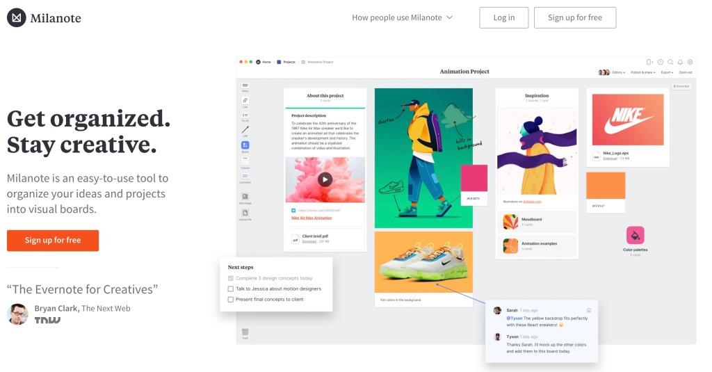
In 2020 I wrote a review about LucidSpark and then made a quick tutorial video. If you’re not too familiar with it and want a quick summary of what LucidSpark does, it is a collaborative tool where people can share and organize their ideas on a near limitless canvas. It is simple and easy to use and I like it.
Then I saw this comment on the video.

Well, I have no loyalty to one product over another and so I thought I would check out Milanote and write a quick review.
Signing up & Pricing
As one would expect from an online service in 2021, the signup process is super easy. You can use your Google, Apple or your personal email account. When you sign in for the first time it does ask you what field you work in and then you’re in your first Milanote board.
I must say I like the pricing too. The limits are related to the amount of content that you use. LucidSpark takes away some collaborative features that are pretty nice.
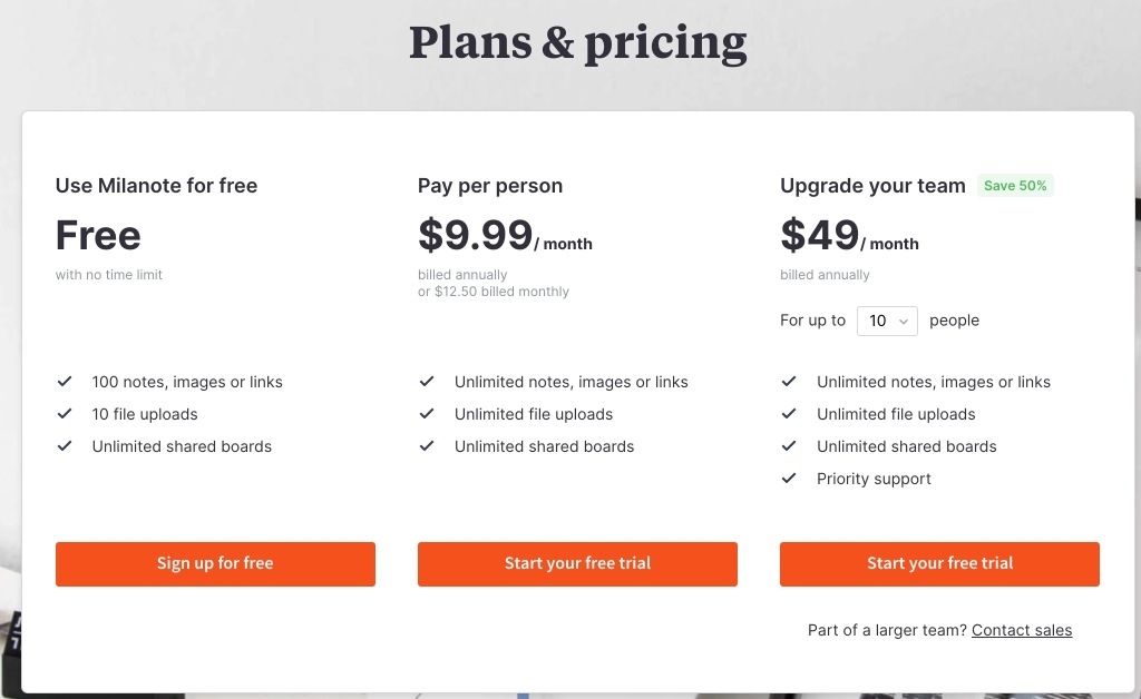
This is their normal pricing, but I did find a reference for their educational pricing in a FAQ.

This is not surprising but always good info! I did not reach out to find out what it would cost but I believe that would depend on how many students would be using it.
Creating Boards
So far things between LucidSpark and Milanote have been pretty similar. Here is where things start to get a little different. Take a look at Milanotes dashboard. It looks like a creative space itself and it is. You can “connect” boards together (though it is only in appearance only as far as I can tell). You can also rearrange your boards to your liking. Most places just list your workspaces in a list or row and you can search by name or date modified, etc.
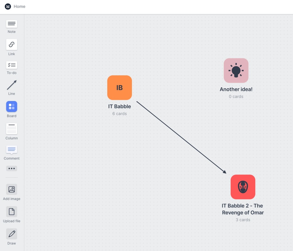
Here everything is right in front you. To make a new board simply drag the Board icon onto the workspace. That’s it. Once you have it in the workspace you can click on it (just once) and you can change the color and the icon. By clicking on the name of the board you can give it a new and unique name.
To delete a board, just click and drag a box around it and then delete it. If you right click on the board you gets lots of options as well.
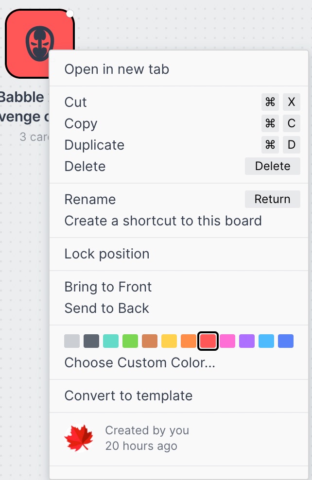
It’s pretty cool. If it is a brand new board. Double click on it quickly and you can choose a template and oooooh boy do they have some templates. Rather than try to write about it, just watch the GIF below.
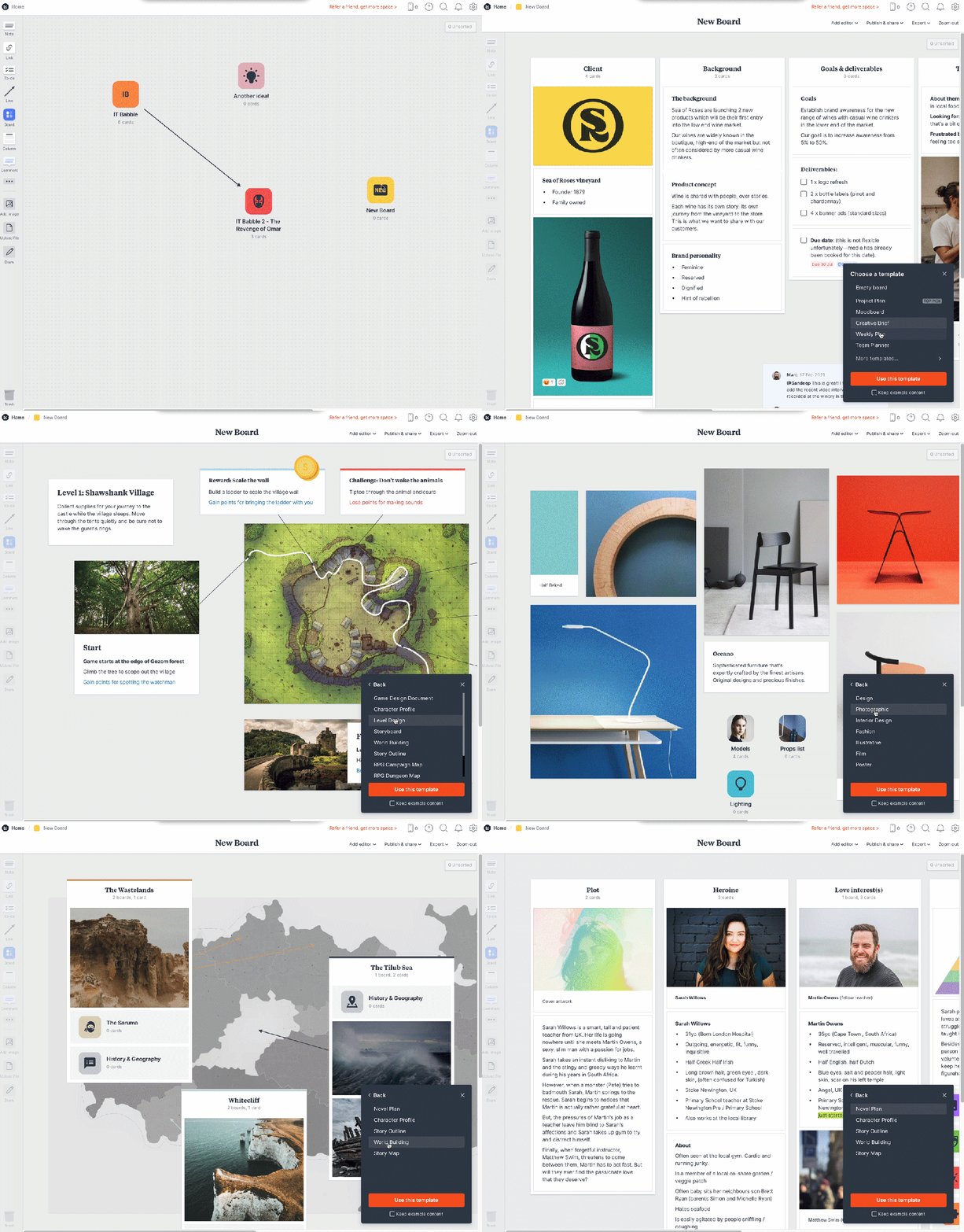
If you already have info on a board you cannot apply a template and double clicking it will just open it up.
Working on a Board
- On the far left hand side is a very simple toolbar. Here you can…
- Add notes
- Add hyperlinks
- To-do lists
- Lines
- Add a board inside your current board
- Add a column – These can hold everything mentioned above
- Comments
- Add an image
- Upload a file
- Draw
Sketches, videos, documents, audio, color, maps and headings are all hidden behind the ellipse in the middle of the toolbar
The difference between Draw and Sketch is Draw will let you draw anywhere in the board. Sketch will put it in its own box and from there you can add that to a column.
Here are some elements on my sample board.
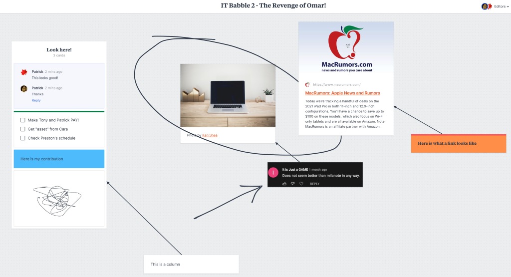
You want an element, just click and drag it onto the board. It’s straightforward and simple and easy. Double clicking any element will bring up more tools. For example, double clicking a website will allow you to change the link, change the description or color, etc.
The canvas does seem to be infinite but unlike other services, you can’t zoom out and make everything super small to the point that you can get lost. That is something that is not welcomed. One thing that milanote is missing is a navigator window. It may not need one, but as your board and ideas grow it may be a nice touch to quickly navigate around.
You can still get around pretty easily by holding the space bar. This turns your cursor into a hand and you can scroll with your mouse to move up and down or hold the Shift key to move left and right. So getting around isn’t too difficult, but not everyone knows about that nifty trick and it’s not advertised here.
I really like the idea that you can a board inside a board. This is great! I don’t know how many times I’ve been brainstorming and simply put different approaches in different areas on the board far away from each other. It works but it doesn’t at the same time.
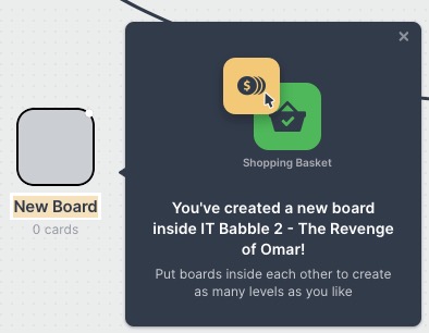
If I’m working on solution A, I would love to see nothing but those ideas, problems, considerations and the like. Having my mythical solution A as its own board solves that. Without it, I’m constantly comparing the two ideas and that is distracting in the planning phase.
Like Lucidspark though, the tools offered are not many, but they are all meaningful. I don’t feel like there are too few options here. Everything I need to get thoughts together is there and I like that. A workspace cluttered with tools and windows is a distraction. This is probably the reason there is no navigation window.
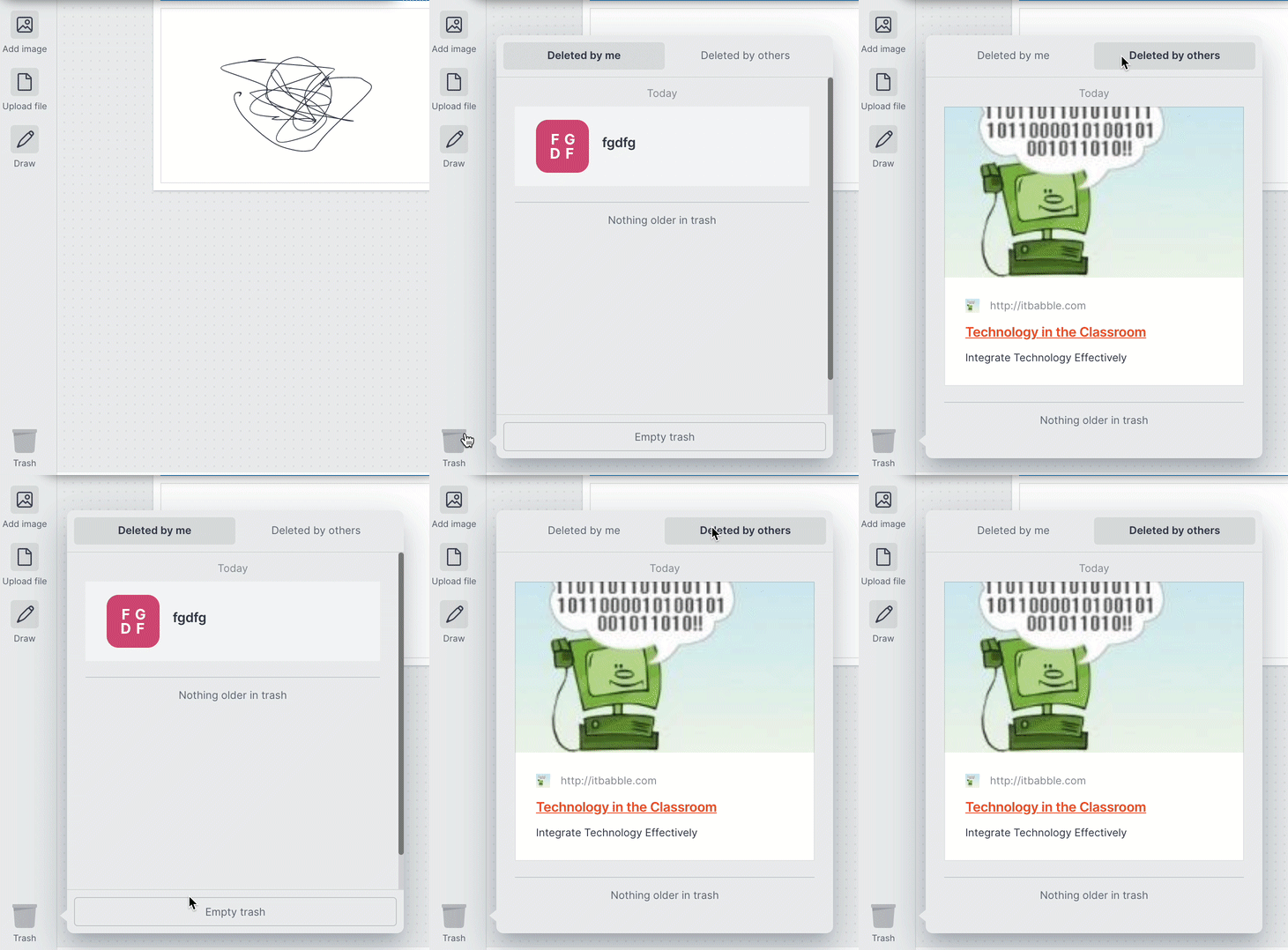
Another cool feature is the trash can. It is located at the very bottom of the toolbar. At first, I thought I would select an item, hit the trashcan and it would be gone. This is not the case. When you click on it, you can see what elements have been deleted and by whom! I can even empty the trash (only for my deleted content) and drag it out of the trash and back into the board.
Collaboration
You can invite and work with people in real time. Like most services, all you have to do is hit the Add editor button near the top right hand corner.
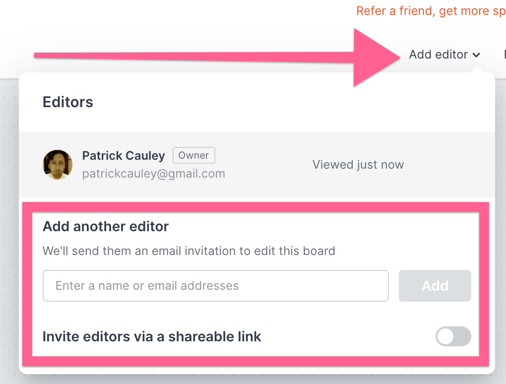
Then type in their email address or get a shareable link and you’re off to the races. For the shareable link, when someone clicks it, milanote requires them to create an account. This is a welcomed obstacle. This makes sure that you know who is working on your board at all times and no anonymous contributors will be there to wreck your work.
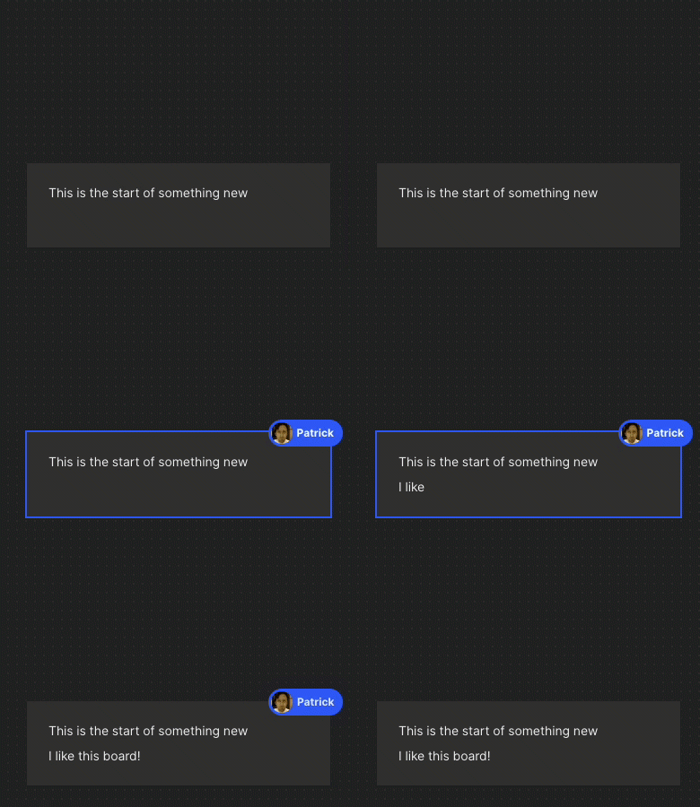
When another user clicks on an element on the board you can see who that is. It’s nice and slick.
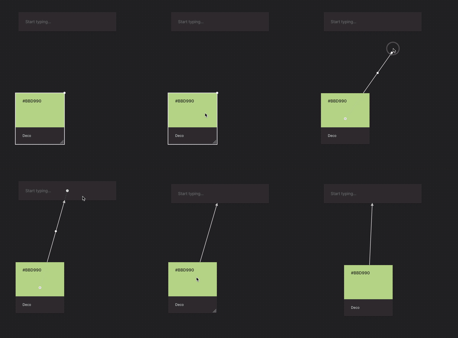
You can also link two elements together. When you move your mouse over an item there will be a white circle and when you click that you get an arrow that you can drag to another element. Once linked the arrow will remain no matter where you move. Nice.
Adding files, images, etc. from your computer is as easy as dragging them into the web browser. PDF’s are uploaded and linked and you get a quick preview of the first page. You can’t scroll through the document, but others will have the ability to comment on it and download it.
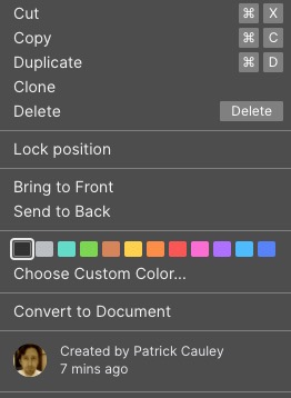
One thing I am not a fan of is you cannot see who posted what from just a glance. If you right click on the element it will tell you at the bottom, but I would really like it if I could just glance and see who is proposing the best ideas.
Another thing I would love to see is a history of changes like in a Google Doc and LucidSpark. Sometimes it is nice to go through the organic method of planning and to see how ideas are forming into the tangible. This is a nit-picking item to be sure, but I thought I would mention it.
Free account limits
I mentioned earlier that the free account does not limit features for you, but it does limit you in a different way. You can only use 100 items in total. So if you have a board for 50 items, then you have used half of your free account limitations. You can check this by clicking the gear in the top right hand corner.
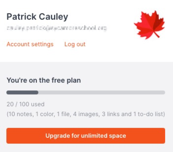
I like this. With a 100 items you can definitely get some room to really do some planning and organizing. It is much more than just a taste or an idea of what a product can offer you and actually accomplish something and really put it through its paces.
Export & Publishing
This is something that Milanote gets right. You have lots of options to export your boards. Check out the image below.
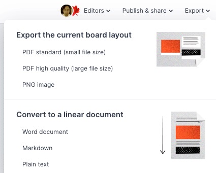
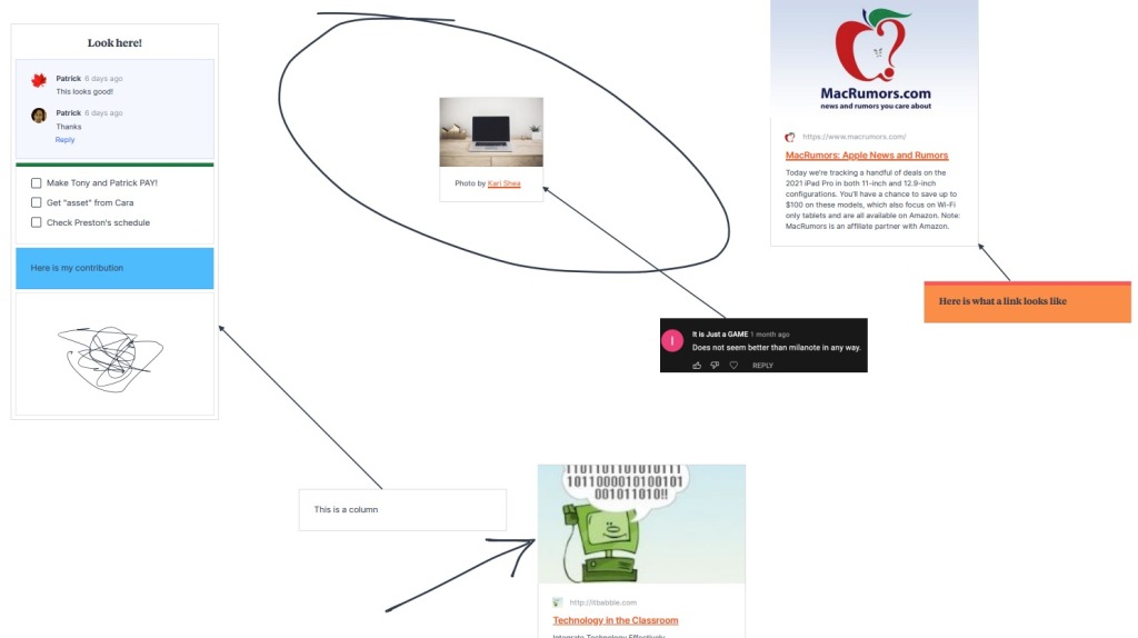
Exporting large boards like this can be a pain. Most places give you the ability to export it as an image (usually a PNG) or as a PDF. The problem here is that if you have a large board it will shrink everything down to try and fit it on a single sheet. This is fine for simpler and smaller boards, but those big ideas need a different format. Here is an image of the PDF version.
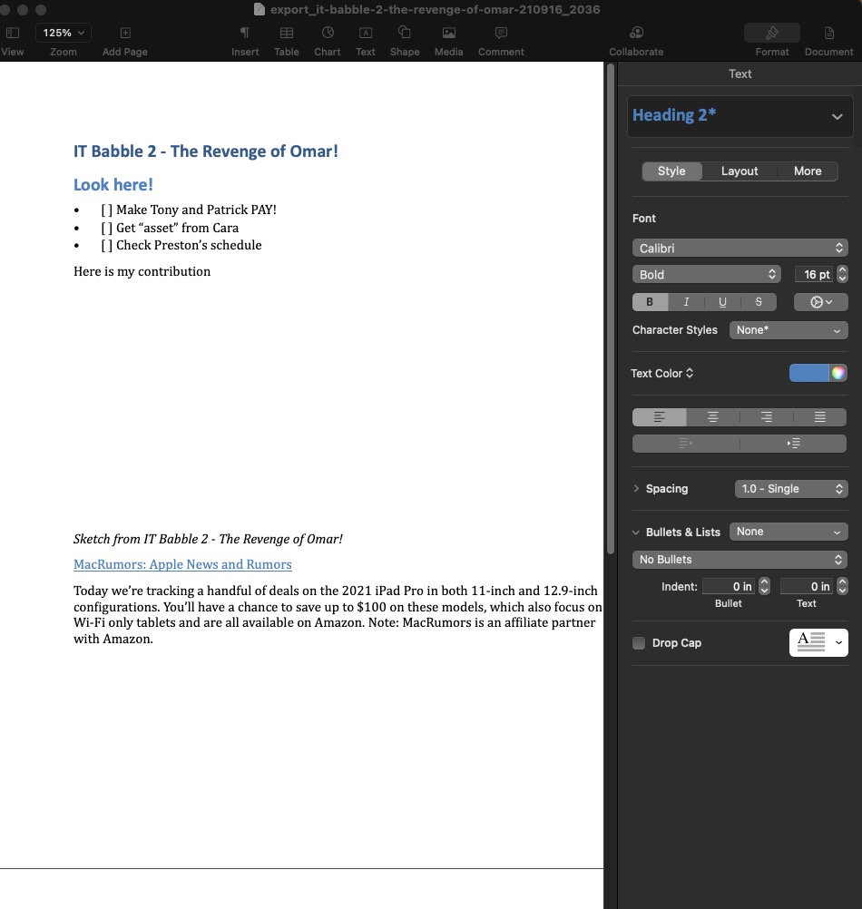
For those larger boards you can download it as a list as a Word document, a Markdown doc or a Text file. Here is what the Word version looks like (I don’t have Word so Pages is opening it). You will notice that my drawing and some images are not in the list, but if you have a large board and need to export, this is definitely the way to go.
You can also share it or publish your board. This is more for presentations. Here you can share it with lots of people via a “secret link” and you have some other options as well. One option that particularly appreciate is the ability to get the HTML code to embed into a website. I like that and you don’t see it very often and usually when you do see it, that feature is behind a paywall.
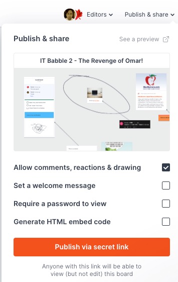
I also like that there is no option for the viewers to edit the board. I do not like anonymous editors. It gives students the ability to “showcase their humor” and that often times ends up derailing your lesson or distract your students which can be a little annoying.
Conclusion
The question I try to answer in this section is should teachers use this tool with their students. I would say that this is good for high school students and beyond. The product is sleek, performs well and is very easy to use. However, with that being said, students should have some executive function skills that they can pull from to organize the board(s). If not I can see it being a time vampire (a tool that causes you to allocate large amounts of teaching time instead of focusing on the content of the unit) and causing disruptions.
I can see younger students adding board, to board, to board, to board to see if they can find the limit of the program. There are also no moderation tools to be seen. Again, this tool isn’t designed for third graders so I am not faulting the devs here.
The tool is met for creative collaboration and Milanote excels at that. If you have a high school drama class looking to come up with set design issues, I would go for Milanote over Lucidspark without question. It is a much better suited tool for that task.
For just brainstorming, you could use Milanote, but I feel Lucidspark has better tools on hand to make it more useful than Milanote. I like the fact that you can tag your notes/items on Lucidspark and then automatically have it arrange them based on that information.
Milanote doesn’t have that ability but again, I don’t think they want that ability. It is targeted for creative designers and not just ideas. Milanote is great and I think for the right task it would be suited for high school and beyond. I wouldn’t try this with most younger students unless it was for presenation purposes.
Also, if you’re a teacher and looking to collaborate with peers – this is a tool to consider for sure.
Source: IT Babble Blog and Podcast

You must be logged in to post a comment.